Installation
Check out this page for installation.
Discover
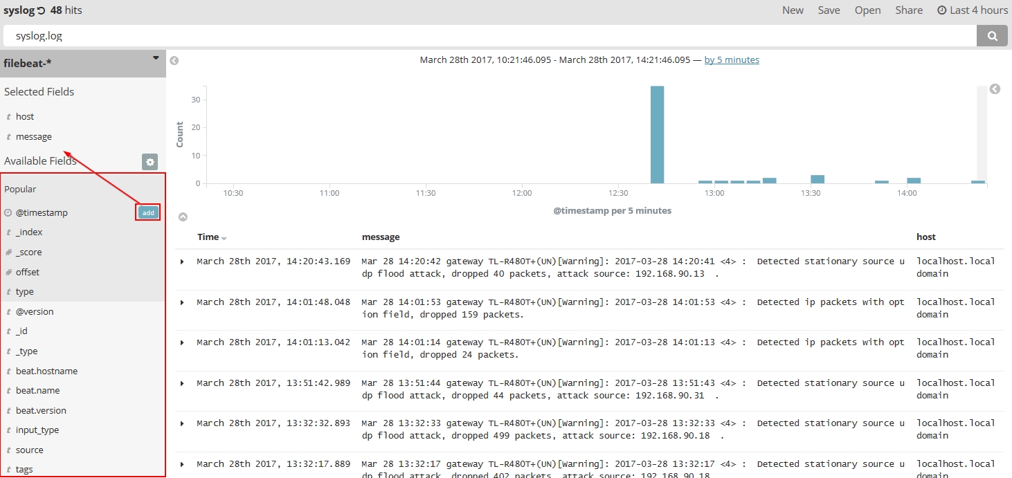
You can find all the detailed entries here, however, it is impossible to read the summary. It’s better to only read the field which is useful for you.
Modify the columns(fields):
By default the entries show all the field. It’s better to modify the columns and only show the ones interest you.
In the middle pane, move mouse to the fields names below “Popular”, an little button “add ” will show up, if you click it, it will show in selected fields.
Visualize the data
Click the Visualize, we choose pie chart here. The default search matches all documents. Initially, a single “slice” encompasses the entire pie, and the default aggregation method is Count, we can change to sum or unit count.
-
- Count
- The count aggregation returns a raw count of the elements in the selected index pattern.
- Sum
- The sum aggregation returns the total sum of a numeric field. Select a field from the drop-down.
- Unique Count
- The cardinality aggregation returns the number of unique values in a field. Select a field from the drop-down.
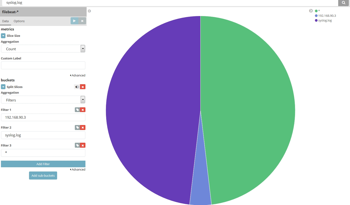
We need to divide the pie according to out standard, in my instance, I need to check how many syslog from host 192.168.90.3, how many from syslog.log file, how many from others source.
click the Split slices , then select Filters under the aggregation, I type 192.168.90.3, then click “Add Filter”, then type syslog.log, and click the Apply change button.![]()
And you will see the pie chart similar to this:
Then click the save in the navigation bar, name it( I choose syslog_chart as the name) and click “Save”. This name can be used in Dashboards.
Dashboards
A dashboard is a collection of visualizations that you can arrange and share. To build a dashboard that contains the visualizations you saved during this tutorial:
- Click Dashboard in the side navigation.
- Click Add to display the list of saved visualizations.
- Click Markdown Example, Pie Example, Bar Example, and Map Example, then close the list of visualizations by clicking the small up-arrow at the bottom of the list.
Hovering over a visualization displays the container controls that enable you to edit, move, delete, and resize the visualization.
Reference
https://www.elastic.co/guide/en/kibana/index.html
https://www.elastic.co/guide/en/kibana/current/tutorial-visualizing.html