According to https://css-tricks.com/the-checkbox-hack/ , you can use a check box to control the content, style of sibling element.
Idea:
So the basic idea
Your Html looks like :
<label for="toggle">Do Something</label>

<input type="checkbox" id="toggle">

<div class="control-me">Control me</div>
Note that the <input> and <div> with control-me tags have to be siblings. below will not work:
<input type=“checkbox“ id=“toggle“>
<p><div class=“control-me“>Control me</div></p>
Your CSS looks like:
.control-me { /* Default state */ }

 #toggle:checked ~ .control-me { /* A toggled state! No JavaScript! */ }
My scenario in wordpress
I will build a product filter for the visitors to select the category of product, so the plugs I will use are:
- Woocommerce
- Advanced AJAX Product Filters for WooCommerce
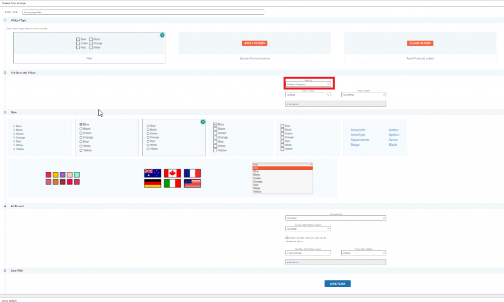
I created a new product filter which has shortcode: [br_filter_single filter_id=1443] detail as below:

In a text wedge, I created below shortcode as the filter:
<h3>Our Pool Related Range<span style="color: #f26322;">. <label id="Home_product_menu" for="sai_toggle"><i class="fa fa-bars"></i></label></span></h3>
<input id="sai_toggle" class="visually-hidden" type="checkbox" />
<div class="range-control">[br_filter_single filter_id=1443]</div>
On the same page, I created below products area:
[products orderby="rating" limit="4" columns="4"]
The page html will looks like:

We can see that wordpress spit out the html code perfectly, three parts are adjacent as expected.
We can see that the <input id=”sai_toggle”> is next to the <div class=”range-control”>, which is the product filter.
next, we are ready to write the CSS.
CSS part
First, I will hide the menu item, to give the user better experience, I will make the menu text not selectable, which is not mandatory.
.range-control {
/*Mandatory below*/
position:relative;
display:none;
z-index:100;

/* Make the text not selectable(optional)*/
-webkit-user-select: none; /* Safari */
-moz-user-select: none; /* Firefox */
-ms-user-select: none; /* IE10+/Edge */
user-select: none; /* Standard */

/*style the menu(optional)*/
margin-left:160px;
margin-top:10px;
padding:10px;
background-color: rgba(255, 255, 255, 0.5);
border:solid 1px #aaa;
border-radius:2px;
}
Then, I will to hide the checkbox.
/**Checkbox for the menu**/
.visually-hidden {
position: absolute;
visibility:hidden;
}
Last, I will let the menu show when the menu bar is clicked, which means the invisible checkbox is checked
#sai_toggle:checked + .range-control{
display:block;
}
Then, I will add more CSS to make the menu right blow the three bar and adjust the position of woocommerce products, which I will not show here.
Final front UI will be like below:

Hide the menu
Now there is only one way to hide the menu, which is by reclick the three bar again, which is not ideal. Many user may complain about this.
I will allow the user to click anywhere to hide the menu, which essentially uncheck the invisible checkbox. I got the checkbox ID ready, which is #sai_toggle
Open the wordpress header.php file, add below codes between <head> </head>.
<script src="https://ajax.googleapis.com/ajax/libs/jquery/1.11.0/jquery.min.js"></script>

<script>
$(function () {
"use strict";

function uncheckBox() {
  var isChecked = $("#sai_toggle").prop("checked");
  if (isChecked) {
               $("#sai_toggle").prop("checked", false);
               }
  }

$("body").on("click", function () {
  uncheckBox();
  });

$("#sai_toggle,label").on("click", function (e) {
  e.stopPropagation();
  });
});
</script>
Now you should have a professional menu filter for the product.